
More than 90% of prescriptions filled in the U.S. are for generic drugs. Yet, many patients still hesitate to take them. Why? Because they don’t understand what generics really are. A pill that looks different, costs less, and has a different name doesn’t feel the same-even if it works the same. That’s where infographics about generics come in. They turn confusing science into clear pictures. No jargon. No fine print. Just visuals that answer the real questions patients have.
What’s Really in a Generic Drug?
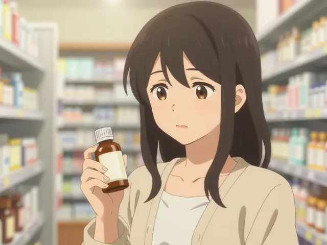
Patients often think generic drugs are ‘weaker’ or ‘lower quality.’ That’s not true. A generic drug has the same active ingredient, dose, and route of delivery as the brand-name version. It works the same way in your body. The only differences are in the inactive ingredients-like dyes or fillers-and the shape or color of the pill. These don’t affect how the medicine works.
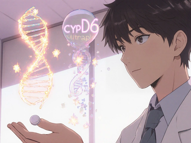
The FDA requires generics to meet the same strict standards as brand-name drugs. Before approval, manufacturers must prove their version is bioequivalent. That means it releases the active ingredient into the bloodstream at the same rate and amount as the original. The FDA uses dissolution testing to measure this. Infographics show this process visually: side-by-side graphs of how quickly the drug dissolves in fluid. One study found that 89% of patients understood this concept when shown in an infographic, compared to just 67% with text alone.
Why Do Generics Cost So Much Less?
Brand-name drugs get a patent that protects them from competition for 10 to 20 years. During that time, the company recovers its research costs. Once the patent expires, other companies can make the same drug. They don’t have to repeat expensive clinical trials. They just prove their version works the same. That’s why generics cost 80-85% less on average.
Infographics explain this with timelines. One popular FDA graphic shows a brand drug’s patent expiration date, then lists the first generic versions that entered the market. It shows how competition drives prices down. The result? The U.S. healthcare system saved $1.68 trillion between 2010 and 2019 from generic use. That’s money back in patients’ pockets and less strain on insurance systems.
How Do Infographics Help Patients Trust Generics?
Patients don’t trust what they don’t understand. A 2021 FDA survey found that 43% of patients worried generics weren’t as effective. Many thought the different color or shape meant the drug was inferior. Infographics fix this by showing the science simply.
The FDA’s ‘What Makes a Generic the Same as a Brand-Name Drug?’ infographic uses icons, arrows, and split screens to compare identical active ingredients. It highlights that the FDA tests every batch of generic drugs. It explains that inactive ingredients are safe and approved. It even shows how the same drug might look different depending on the manufacturer-like how a Coke can look different in different countries, but still tastes the same.
Pharmacists report these visuals cut counseling time in half. One pharmacist on Reddit said they keep a printed copy behind the counter. ‘It calms anxious patients every time,’ they wrote. At Kaiser Permanente, 78% of pharmacists used the infographics regularly. And 63% saw fewer patients refuse generic substitutions.

Who Makes These Infographics-and Are They Reliable?
The FDA is the biggest creator. Their infographics are free, downloadable, and available in Spanish. They’re designed for an 8th-grade reading level. Each one goes through patient testing with at least 30 people before release. The average comprehension score? 87%.
Other groups like the GTMRx Institute and BeMedWise also make materials. But the FDA’s are the most trusted. Why? They stick to evidence. They don’t overpromise. They cite the science behind each claim. GTMRx focuses more on how generics fit into overall medication management. BeMedWise ties them to pill trackers and safety checklists. But only the FDA covers the full regulatory process in one place.
Independent reviews show FDA infographics score 4.7 out of 5 for clarity among healthcare providers. The American Medical Association rated them ‘highly effective’ for helping doctors explain generics to patients.
Where Are These Infographics Used?
You’ll find them in waiting rooms, on pharmacy websites, in patient portals, and even inside electronic health records. Epic Systems added FDA infographics to their platform in late 2022. In the first six months, they were viewed over 450,000 times.
Health clinics print them on letter-sized paper and put them on counters or bulletin boards. Hospitals email them to patients after discharge. Pharmacies include them in discharge packets. They’re also shared on social media by clinics and public health departments.
They’re designed to work on any device-phones, tablets, computers. File sizes are small enough to load fast. Colors are high-contrast for readability. Every image has alt text for screen readers. They meet accessibility standards so no one is left out.

What’s Missing-and What’s Coming Next?
Not all infographics are perfect. Experts point out one big gap: narrow therapeutic index drugs. These are medications like warfarin or levothyroxine, where tiny changes in dose can matter. Some infographics imply all generics are perfectly interchangeable, which isn’t always true. Pharmacists still need to flag these cases. The Institute for Safe Medication Practices says future versions should include visual alerts for these drugs.
Another issue? Health equity. African American and Hispanic patients report higher concerns about generic quality than White patients. Only one FDA infographic directly addresses this, showing how generics reduce access gaps for low-income and minority communities. More need to follow.
Looking ahead, the FDA is testing augmented reality. Imagine scanning your pill bottle with your phone and seeing a 3D model of how the drug dissolves-comparing brand and generic side by side. A prototype shown in 2023 lets patients rotate the molecules and watch the process in real time. This could be available by mid-2024.
By 2028, experts predict generic use could reach 95% if education keeps improving. That means billions more in savings. But only if patients understand why it’s safe.
How to Use These Tools in Real Life
If you’re a patient: Download the FDA’s ‘Facts About Generic Drugs’ infographic. Keep it on your phone. Show it to your pharmacist if you’re unsure. Ask: ‘Is this the same as my brand drug?’ and point to the graphic.
If you’re a caregiver or family member: Print one and put it near the medicine cabinet. Talk through it with the person you help. Use it to answer questions like, ‘Why does this pill look different?’
If you’re a healthcare provider: Add the infographics to your patient portal. Print a few copies for your waiting room. Use them during consultations-not as handouts, but as conversation starters. One doctor said, ‘It’s not about teaching. It’s about removing fear.’
There’s no training needed. No apps to download. Just open the PDF. Show the picture. Let the visuals do the talking.
Are generic drugs as safe as brand-name drugs?
Yes. The FDA requires generic drugs to meet the same strict standards for safety, strength, quality, and performance as brand-name drugs. Every batch is tested. The active ingredient is identical. The only differences are in color, shape, or inactive ingredients-none of which affect how the drug works.
Why do generic pills look different from brand-name ones?
By law, generic drugs can’t look exactly like brand-name drugs. This prevents confusion and protects trademarks. The difference is only in the appearance-color, shape, size, or markings. The active ingredient, dosage, and how it works in your body are the same.
Can I trust a generic drug made by a company I’ve never heard of?
Yes. The FDA inspects every manufacturing facility-whether it’s in the U.S., India, or elsewhere. All factories must follow the same quality rules. A generic drug from an unknown company is held to the same standard as one from a well-known brand. The FDA tracks every batch and can shut down a plant if standards aren’t met.
Do generics take longer to work than brand-name drugs?
No. Bioequivalence testing proves that generics release the active ingredient into the bloodstream at the same rate and amount as the brand-name version. Studies show no meaningful difference in how quickly they start working. If a generic worked slower, the FDA would not approve it.
Are there any drugs where generics aren’t recommended?
For most drugs, generics are equally effective. But for a small group called narrow therapeutic index drugs-like warfarin, levothyroxine, or phenytoin-small differences in blood levels can matter. In these cases, pharmacists may recommend sticking with one brand or generic. Always talk to your doctor or pharmacist if you’re unsure. Infographics don’t replace professional advice for these drugs.
Where can I find free generic drug infographics?
The FDA offers a full library of free, downloadable infographics at fda.gov/generics. They’re available in English and Spanish, print-ready, and optimized for mobile viewing. Other trusted sources include the GTMRx Institute and BeMedWise, but the FDA’s are the most comprehensive and widely used.
15 Comments
So let me get this straight-we’re spending billions on brand-name drugs because people are scared of pills that look different? Like, if my Tylenol turned into a pink octagon, I’d still take it. It’s not magic, it’s chemistry. And yet we treat generics like they’re knockoff AirPods. The FDA’s got more oversight than my ex’s Instagram account.
As a pharmacist, I’ve seen this firsthand. Patients will argue for 20 minutes about why they ‘need’ the blue pill instead of the green one-even when they’re the exact same drug. We keep the FDA infographics printed and laminated behind the counter. One guy cried when he realized his blood pressure med was the same. Not because he was saving money-because he finally stopped feeling like a guinea pig.
I showed this to my mom last week-she’s 72 and has been refusing generics for years. She said, ‘I don’t trust anything that doesn’t look like the commercials.’ I printed the infographic, pointed to the side-by-side graphs, and she just nodded. No lecture. No yelling. Just… understanding. It worked. Sometimes, a picture really is worth a thousand prescriptions.
Can we talk about how wild it is that we’re still having this conversation in 2025? We’ve got Mars rovers and AI that writes sonnets, but we can’t get people to believe that a pill without a logo isn’t a scam? The real tragedy isn’t the cost-it’s that we’ve made patients feel dumb for asking questions. These infographics don’t just explain science-they restore dignity.
The epistemological framework underlying generic drug acceptance is predicated on a conflation of perceptual similarity with pharmacological equivalence-a cognitive bias exacerbated by pharmaceutical marketing. The infographic’s efficacy is not in its clarity, but in its reduction of complex bioequivalence metrics into aesthetic binaries. It is a triumph of semiotics over science.
While the data presented is compelling, I must question the generalizability of the FDA’s patient-testing cohort. Were participants stratified by socioeconomic status, literacy levels, or prior exposure to pharmaceutical education? The 87% comprehension rate sounds impressive, but without transparency in sampling methodology, it risks appearing as a marketing metric rather than a validated educational outcome. The underlying assumption-that visual aids alone can overcome systemic distrust-may be overly optimistic.
Man, I love this. It’s like the FDA finally stopped talking like a textbook and started talking like a human. I showed this to my cousin who’s on warfarin-he was terrified switching generics. I pointed to the ‘narrow therapeutic index’ section, and he just said, ‘Oh. So I just gotta stick with one brand?’ Boom. Problem solved. No jargon. No panic. Just a picture that said, ‘You’re not being cheated.’
Wait… so you’re telling me the government is pushing this because Big Pharma is losing money? And now they’re using ‘infographics’ to brainwash us into taking cheap pills made in India? Did you know the FDA gets funding from drug companies? This is a controlled narrative. The real difference? The inactive ingredients are often toxic fillers. That’s why people get sick. They’re not ‘safe.’ They’re just cheaper. And you’re all drinking the Kool-Aid.
Canada’s been doing this right for decades. We don’t need fancy graphics-we have universal healthcare and real oversight. Meanwhile, Americans are out here scared of green pills like they’re alien tech. You think this is about science? Nah. It’s about profit. The U.S. pays 5x more for drugs because you let corporations own your medicine. These infographics? Just a Band-Aid on a bullet wound.
Infographics? LOL. The real issue is that 90% of generics are manufactured in China and India where GMP standards are… flexible. The FDA inspects 1% of facilities. The rest? Paper audits. The bioequivalence studies? Often done on 20 healthy young males. What about elderly, obese, or diabetic patients? The data is garbage. This is propaganda dressed as education.
Generic = same active ingredient. Period. The rest is branding. The pill’s shape doesn’t change its half-life. The color doesn’t alter receptor binding. The FDA doesn’t approve weak stuff. End of story.
I’ve been on generics for 8 years. Never had an issue. My thyroid med used to cost $120. Now it’s $12. I don’t care if it’s purple or round. It keeps me alive. The infographic helped my sister understand why we switched. She used to think it was ‘second-tier.’ Now she prints them for her book club. Small wins, right?
Let’s be real-this is just corporate rebranding with a side of virtue signaling. The FDA doesn’t care about patient education-they care about reducing liability and shifting costs to taxpayers. The ‘87% comprehension’ metric? Probably pulled from a focus group of college students who thought ‘bioequivalence’ was a new Starbucks drink. Meanwhile, real people are still getting confused, scared, and sometimes, harmed. This isn’t transparency. It’s PR with clipart.
The structural inequities in generic drug perception cannot be resolved through visual aids alone. While the infographic’s clarity is methodologically sound, its deployment remains contingent upon access to healthcare infrastructure, digital literacy, and linguistic fluency. The assertion that ‘a picture is worth a thousand prescriptions’ presumes a level of systemic equity that does not exist. For marginalized populations, the barrier is not comprehension-it is availability, affordability, and trust in institutions that have historically failed them.
My doctor showed me one of these last month. I was freaking out because my new pill was orange instead of white. He just pointed to the graphic and said, ‘Same stuff. Different wrapper.’ I laughed. Then I cried. Because I’d been scared for three years over a color change. This thing? It’s not just helpful. It’s healing.
Write a comment